Posted on

How do you frame a lino print?

Picture framing can seem like a dark art to the uninitiated. There is a mind-boggling array of options from the glazing (glass or acrylic, non-reflective, UV resistant?) to the moulding (hand-made, factory made, wood, composite, plastic?) and the price will vary with the same mind-boggling range and variety. How do you know what you are really paying for?

I was equally bamboozled and unfortunately wasted much money and time on disappointing products until I discovered my now favourite supplier for picture frames – Brampton Framing – who I have been using for several years since.  They are a family-run business with Fine Art Trade Guild certified picture framers employed to make up the frames.

Working with their products has taught me to really appreciate the beauty of a well made frame. There are faultless corner joins, quality card mounts and reassuringly solid materials. It actually makes the tedious job of framing up my prints more of a joy!

I frame all of my prints myself for reasons of convenience. I can frame up works as and when required rather than having a lot of stock getting dusty between exhibitions. I’ve learnt a few trade secrets along the way.

For example, it’s a little known fact that a work on paper is “hung” inside the frame using just one strip of acid-free tape at the top of the cardboard mount on the inside. Paper expands and contracts with moisture so if an artwork is taped on all sides then it will warp and bulge.

After setting the print I tape all sides of the back of the frame to seal it and add an information sticker. Then D-rings are screwed into the frame and picture cord strung between them. This is a much more secure way of hanging a frame than using the clips or hooks which often come with shop-bought frames.

I am grateful that companies like Brampton Framing who produce fine quality hand-made products still exist. Craftsmanship is too often under-valued in the modern world and I think that is something all artists can sympathise with.

I was also pleased to read that the picture framers I use source their products and services locally whenever possible and promote energy and paper conservation in their workplace. They purchase their moulding and mountboard from companies who try to only use timber that meets sustainable forestry policies. It’s a step in the right direction at least, and gives me more peace of mind when using their products.

I hope my blog helps to throw some light on the dark art of picture framing, and starts you thinking a bit more about framing too.

Posted on

What is Handmade Japanese Paper?

I describe nearly all of my lino prints as being printed on “Handmade Japanese Paper”, and many customers may wonder what this actually means and why it’s important.

Printmakers, including photographers who sell prints, will often list the type of paper used in their artworks and it’s a good indication of the quality and care that has gone into the product. 

Some papers are better for printing on than others. Printmakers will look for “wet strength”, absorbency and a suitable surface quality to print on (very smooth if printing by hand without a press). Finally, for professional prints being sold to customers, there’s the all important longevity of the paper. The paper must be acid-free. Anything with a high acid content such as newspaper or cheap drawing paper will turn yellow with age. A good quality paper should be able to see out several centuries and still look good.

Personally, the fact that the paper I use is handmade is also a very important factor and for this reason I source my papers from the Awagami Factory in Japan where beautiful papers are hand-crafted using natural and renewable plant resources. It’s an impressive fact that the Fujimori family who run the Awagami Factory have been making paper for as many as six generations! You can read more about them here; https://awagami.com

The Awagami paper “Hosho Select” is the paper I have been using now for several years. It is strong, supple and a lovely warm shade of white. One side is slightly textured and has a fibrous nature, but the other side is amazingly smooth, just like a fine silk.  It is this extreme smoothness that makes it such a good printing paper – it allows for great contact between the plate and the paper, meaning a great print every time.

Posted on

What is a limited edition print?

Ever wondered what those numbers in the bottom corner of an artwork really mean? Is it a good thing if the number is small or big? Editioned prints can confuse people… even those who have been working in the art industry for some time.

I’ll explain how I go about editioning my own lino prints and it might help shed some light.

When I design a lino artwork I decide how many copies of the print I will make. I print exactly that amount and no more. Each print is then labelled in the bottom left hand corner. The first print is labelled number 1, the next number 2 and so on. The number is written in front of another number which states the total amount in the edition so the owner knows exactly what they have bought. For example 1/20 means they have bought the first print in an edition of just 20.

Why is it important?

If an artist’s work becomes significantly valuable then this is vital information for valuers as a print from a small edition is going to be worth more than a print from a large edition due to its relative rarity. Not many printmakers are expecting their work to be valued at Christie’s, however it is still an important responsibility when selling prints to let the buyer know exactly how many other copies exist in the world and therefore how unique their purchase is.

Big editions or small?

Some artists sell in huge editions, particularly if their work is popular and they can satisfy a large market of buyers, but also if their prints are made by a process that easily produces large quantities eg digital printing. They may even have technicians to help with the workload. This is all great news for the artist and doesn’t really de-value the print itself to the current owner.

When I print my editions the numbers are a lot smaller. I choose an edition of around 20 for my smaller pieces and as low as 5 for the larger artworks. This is because printing by hand with a baren is hard work and I have chosen a career as an artist and not a machine! 

Printing in small editions does mean that the artworks are pretty special… there’s not many of them in the world. But then, I would argue that what makes a piece of art truly special is what it means to you, regardless of any numbers, price tags or editions.

Posted on

Small Wonders

The lino printing project I am currently working on is a small one.

After spending the last two years producing large prints for the walls at Chalk Gallery in Lewes, I have recently returned to working on a more intimate scale, similar to that with which I began my work as a lino printer and first became absorbed with this addictive process.

The subject matter I am studying at present also lends itself to attention on a smaller scale, with a quiet and gentle focus; Snails, and garden insects, small creatures going about their daily business, easily overlooked but so important in the part they play in the larger story of biodiversity.

The idea came to me while I was walking alongside the local riverbank one morning after the rain.

I live in a beautiful part of the countryside and find inspiration easily in the natural landscape around me. Unlike many of the other local artists who I am friends with however, I find myself drawn to the detail. While they paint outside in all weathers, recording the undulating hills of the South Downs, the swathes of grassland or vast seascapes I tend to find myself gazing at a single blade of grass. My countryside walks are never long ones and I have usually found something to draw or photograph within a few yards.

On this particular morning it was the brilliantly coloured baby snails which caught my attention, straggling across the path (I rescued a few) and winding themselves up cow parsley stems. The contrasting pale yellow and deep brown stripes on their shells is an excellent design; eye-catching, high in contrast and almost hypnotic. Perfect for printmaking. It wasn’t long before I was crouching among the wet grass with my mobile phone and some curious looks from passers by. The idea to create some small works, celebrating small wonders, was fully formed

The project is currently in its very early stages with two potential linoprints begun this week. Carving designs on this scale presents some challenges of it’s own. The temptation would be to use smaller and smaller tools in order to capture finer and finer detail. However for me it is always the “maker’s mark” which appeals in linocuts, so apart from a few very fine marks, the main image has been carved with my favourite pfiel tool number 9. Carving with this approach means simplification is necessary, and conscious choices have to be made about what is truly important to the image and helpful in the design.

Re-creating a small subject on a small scale is satisfying in it’s symmetry. The final pieces in this project will be small, and will need small frames, and a quiet space to be enjoyed. They would be lost on a feature wall. I like the thought that one day in the future, when someone pauses on a staircase, or a landing, to look into the frame, they will be greeted with a special and intimate moment, rather as I was that morning on the riverbank with the snails and the rain. It will feel meaningful.

Maybe art doesn’t always have to make large statements. Sometimes it can make connections instead.

Posted on

Garden Birds

This Spring I have been working on a set of prints about the birds which visit our garden. It started with the blackbird who regularly demands my attention with its chirpy presence as it bobs from branch to branch. I think it is a bird which must be loved by many a printmaker for the inky blackness of its feathers and the cocky silhouette it creates against the sky. From this starting point I was soon drawn to record more of the feathered visitors to our garden. Maybe it is the fact that we are hoping to move house this year that made me want to capture a memory of my favourite birds whom I have grown to love over the last eleven years.

The wood pigeon attracted me next. I was fascinated by the softly graduated tones in his colouring and puzzled over how to separate these out in the reduction process. A reduction print involves taking away sections of lino after each colour is printed and means that you have to work in reverse, building up each colour in order. I enjoy the artistic challenge in reducing a subject down to just two or three colours while still being true to its nature. The wood pigeon received a disc of colour to his belly where in nature there would be a much more subtle blush. It is a stylisation we are familiar with in representations of robins and I felt it would work.

This pair kept me absorbed for some time and I enjoyed their company while ruminating on a second pair which would form a quartet of birds. I chose a robin because of the jolly colour separation, and a sparrow for the beauty in the pattern on their wings. Sadly I had to reject the blue tit on the grounds that there were just too many different colours to work with and it would break the pattern of the two-colour reduction print which marked the set. I’m sure there will be a future place for the blue tit. It is still a very welcome visitor to the garden, and we are hoping a family might take up residence in the nesting box we set up this year.

A background setting was chosen for each bird using plants from the garden or familiar to me through my studies. The accent colour of the plant would be the same accent colour as that of the bird due to the use of only two colours, so that dictated my selection. The blackbird had to have a golden beak so the yellow/red apples of the crabapple tree where it often feeds were an obvious choice. The soft pinks of the wood pigeon suggested roses, and although there are none in flower at this time of year, the blooms of the camellia are very similar in shape and became the floral background in which the pigeon is resting. Tiny spring blossoms for the robin in a red which appears pink when used in small amounts, and the soft grey of pussy willow buds for the sparrow completed the series.

I am pleased to have completed my four garden friends and know that I can now take them with me wherever I go. I can enjoy them from the comfort of my own walls when not sharing the space of the garden with them.

It also pleases me how succinctly they sit within their framework of branches. Observing nature, and particularly birds, teaches me about the art of living harmoniously with ones environment. Whether through camouflage or nest-building, wildlife has a way of finding connections and being at peace. I hope when our family finally moves house we will nestle into place as comfortably as these birds. I think I shall take a leaf out of their wise books and seek out a place to feel at home and in harmony.

Posted on

Staying Warm

With the recent rise in energy bills in the UK, and increasing concern over the need to reduce our use of fossil fuels, the topic of staying warm is a keen one on our minds. The need to stay warm in the midst of a British winter is important and often impacts on our daily lives and routines. Do we find ourselves going out less? spending less time in our gardens? keeping windows and curtains closed and wearing odd assortments of clothing which keep the heat close to our skin? Yes, all of these. Apart from the very hardy among us, we have been doing these things all of our lives to some extent, growing up with the experience that getting through winter is an annual challenge we must meet. And for some, this will be more the case now than ever.

I decided early on that cold mornings in the garden studio this winter were not going to do my sense of well-being any good. Despite electric heater, fingerless gloves and fleece, the cold still gets into your bones out there somehow. I planned instead to bring as much of my lino printing practice as I could to the kitchen table. This would ultimately change my relationship with my subject matter. The kitchen environment lends itself to the subject of still life more than anything; pots, pans, cylindrical forms and the paraphernalia of human life. Cezanne would feel at home. I was not quite ready however to leave my favourite subject of the garden, with it’s flora and wildlife behind, so I brought the outdoors with me and created a still life of gentle eucalyptus stems and pussy willow branches.

It is the quiet, silvery colours of these plants that drew me in initially, as well as the structural repetition of their stem pattern. The buds or leaves are positioned at rhythmic intervals along the vertical branch creating a harmonious and pleasing visual effect. Placing them in a vase was necessary to create the uplift in the composition but the vase is not included in my final prints. For me it is all still all about the plants. The subject matter is maybe in one way “Still life” but without the traditional elements included. Also, more in the manner of botanical illustration, each plant is depicted on its own; confronting its own identity, rather than exploring a relationship with another.

Despite the eucalyptus and willow being alone in their frames, I link the two prints via the design process as much as possible so that they form a pair which can be hung together. Colours are duplicated and the same background elements are used in each, introducing a pop of yellow which activates the cool tones in the plants. The “weave” effect of the pattern is something I have used before in my prints, and to me it suggest a nurturing domestic environment. These plants are definitely indoors, and not in their natural environment, but hopefully in a happy and familial space.

An aside to any lino cutters who read this blog; I would not recommend creating this pattern when using Japanese Vinyl – it was tough work cutting across the ridges of lino as I created the design and I was fearing developing a repetitive strain injury by the end of it! Maybe next time I will create the background pattern separately using a nice rubbery piece of Esdee Softcut instead!

Once carved, the final stage of producing the prints took place back in the garden studio where I have a workbench crisscrossed with registration marks and a specialist drying rack. I had to brave the cold for a little in the end.

It has been a few weeks now with the inks slowly drying out there in the January air, but having checked on them today I can see that “Eucalyptus Stems” and “Willow Branches” will be dry enough for signing and framing next week.

If they appeal to you, keep an eye on my website shop where they will appear shortly. There are only 5 copies of each. I hope they bring warmth to the future homes where they hang.

Posted on

INK at Colonnade House

What a treat! To exhibit alongside fellow printmakers from Sussex in an exhibition dedicated solely to matters of printmaking. “INK” is curated by Peon Boyle of Sussex Printmakers and showcases the work of artists working in the medium of screen print, lino print, collograph, monoprint, etching… It’s all here.

While exploring the work on display it struck me how apt the name for this exhibition is. The medium of ink is present and is important in every aspect. Sometimes thick and raised from the surface of the paper, sometimes machine-smooth in it’s application. Resonant, moody tones created through intaglio, versus opaque colour blocks made with relief printing methods. What is it that drives our obsession with this colour-infused and oily substance which often clings to our hands and overalls as much as to the plate?

Printmaking is, in essence, the act of transferring a colour from one surface to another by pressing. It is a coming together of surfaces. Touch is the secret ingredient and is the method which creates the image. In the case of print, it is not necessarily the movement of the artists hand, the gesture or the mark so much, but a meeting between paper and plate whereby an image is produced. It is a record of something that has taken place. A good example of what Roland Barthes referred to when talking about photographic prints as a depiction of ‘what was’ and not “what is”.

In ancient times Japanese fishermen inked the bodies of fish they had caught and pressed the scaly surface to paper in order to record their catch. In even more ancient times the earth pressed tiny sea creatures into soft sediment creating fossils. Pressing then, is a process of fixing things, catching time or preserving a moment? Perhaps this is what draws artists to the press and the plate, and the medium of ink.

A seed head, a skull, waves fixed in mid-motion, pebbles on the beach and the turning screws of the press itself. It’s all here, ready for you to contemplate, in your own time, at INK.

“INK” at Colonnade House in Worthing, runs from 14th September to 1st October 2021.

Exhibiting Artists;

Anna Vartianinen, Barbara Byars, Sue Hawksworth, Rosemary Jones, Sarah Sepe, Melissa Birch, Martha Harris, Hattie Lockhart-smith, Nora Young, Vicky Gomez, Nicola Brewerton and Peon Boyle.

Posted on

Taking part in an Open Studio or Art Trail event

40 years ago, Ned Hoskins, a Brighton artist, opened his own home to the public in order to exhibit his work.  It was a result of what he saw as a shortage of good gallery space in Brighton at that time.  He invited artist friends to exhibit alongside him. Other houses in the neighbourhood soon joined in, and the event grew in number each year. The Brighton Open House festival now averages around 100 venues stretching across a wide area of Sussex.

I don’t know whether Ned Hoskins was the very first to do this but he was certainly a pioneer. These days the local Art Trail, Art Festival, Open Studios or Open House event comes in many shapes and forms but all have grown in popularity vastly.  If you do a little investigation, you will find that nearly every town in the UK has some sort of collaborative organisation in which the makers and artists’ open either their studios, homes, garages or gardens to the public in order to display and sell their work. 

The success of these events makes a lot of financial sense. Without the overheads and administration costs incurred by a gallery, which can often necessitate up to 40% commission, both the buyer and the artist come out better off.  Selling work directly to the people of your local community is also very rewarding and results in a lot of good feeling on both sides. After all, who doesn’t love a work of art made with a local story attached, often featuring much admired aspects of the area you live in.
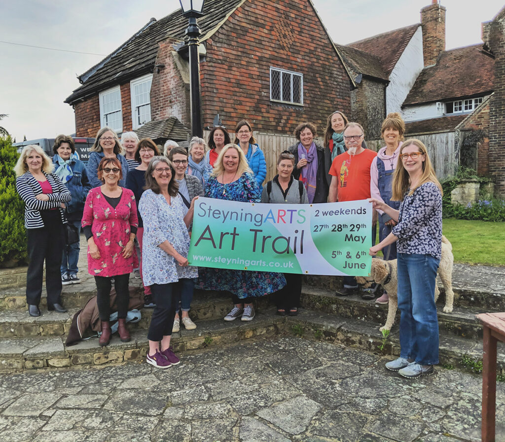
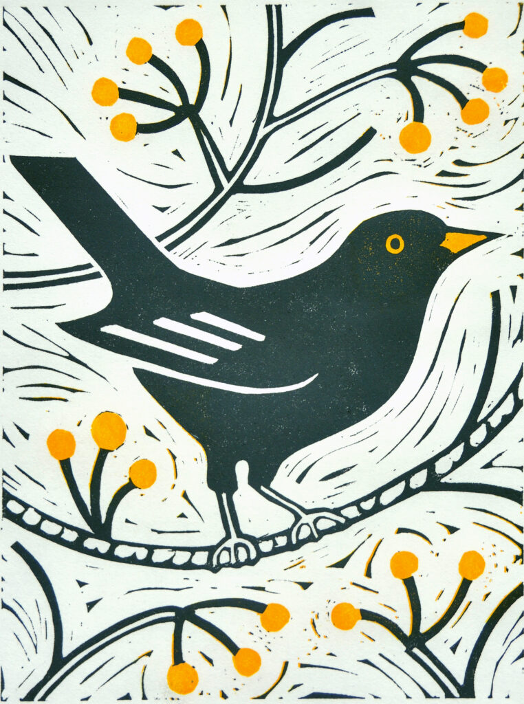
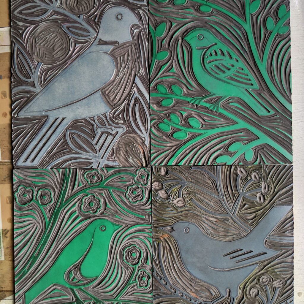
Steyning Arts, of which I am currently Co-Chair, is lucky to be based on the edge of the South Downs and the stunning local scenery does indeed feature in, or inspire many of our artists’ work, but not exclusively.  One of the more surprising bonuses of being a member of a local art group is the diversity and breadth of subject-matter, medium and approach of our 70 odd members. Because there is no “House Style”, no need to conform to a particular market or customer, we find ourselves joined by makers and artists of all disciplines, constantly being surprised and delighted by the unique aesthetic each brings to the group.

I started exhibiting with Steyning Arts three years ago and gradually became more involved and active within the group until becoming Co-Chair with the very talented and dynamic artist Amanda Duke.  I made the decision to open my own house in the Art Trail two years ago and hope I will continue to do so indefinitely, as I can honestly say it has been the most enjoyable experience.

I would like to be able to share some of my experiences below and hope to encourage other artists, wherever you are situated, to have a go at turning your abode into an exhibition space. The benefits are considerable; you will make connections with visitors who now know who you are, where you live and what you do, you will have complete control over how your work is shown and the overall feel of the event, you can add personal touches, give live demonstrations and tell people more about your work this way. Finally, you can relax in your own garden, or even get on with some work in between visitors!

Here are some things to consider before beginning;

Space

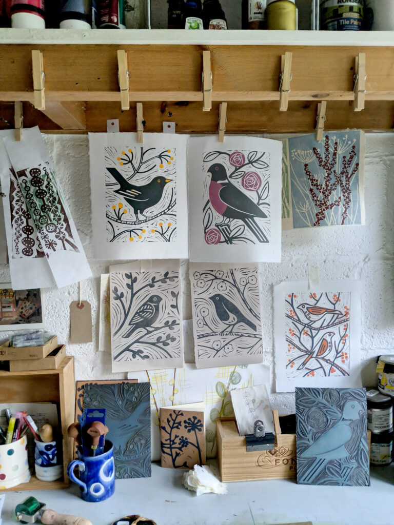
Consider which part of your house would make the best gallery space, enabling visitors easy access, some clear wall space when you have cleared it, and the potential for your family to maintain some private living space during the exhibition time. For us it works well to clear the front room, screening off the rest of the downstairs area with display boards. Clearing the space is time-consuming, but is worth it, and you would be surprised how good a de-cluttering session can feel.
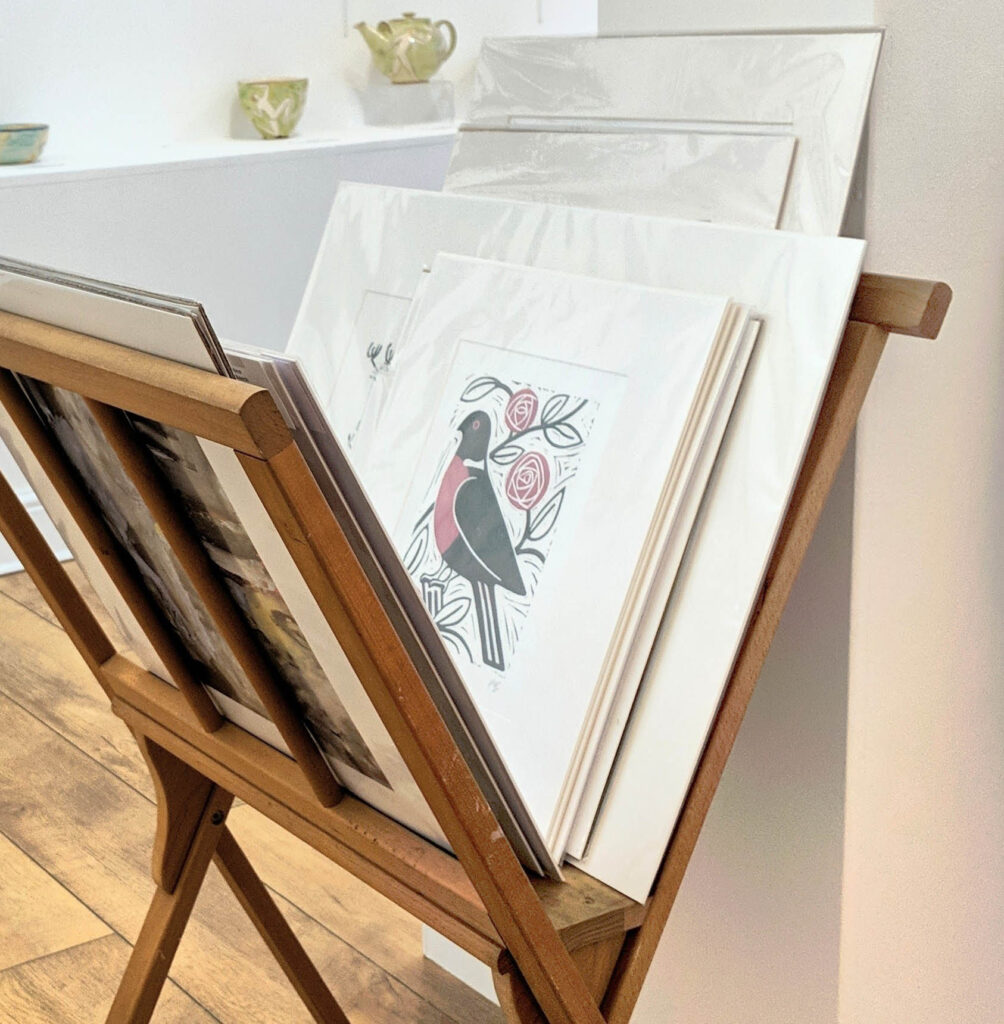
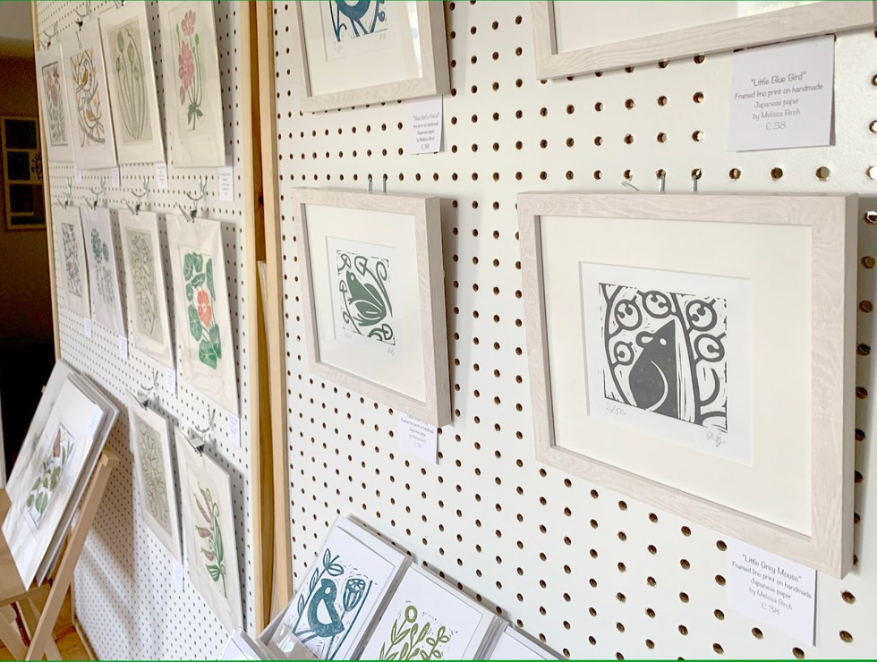
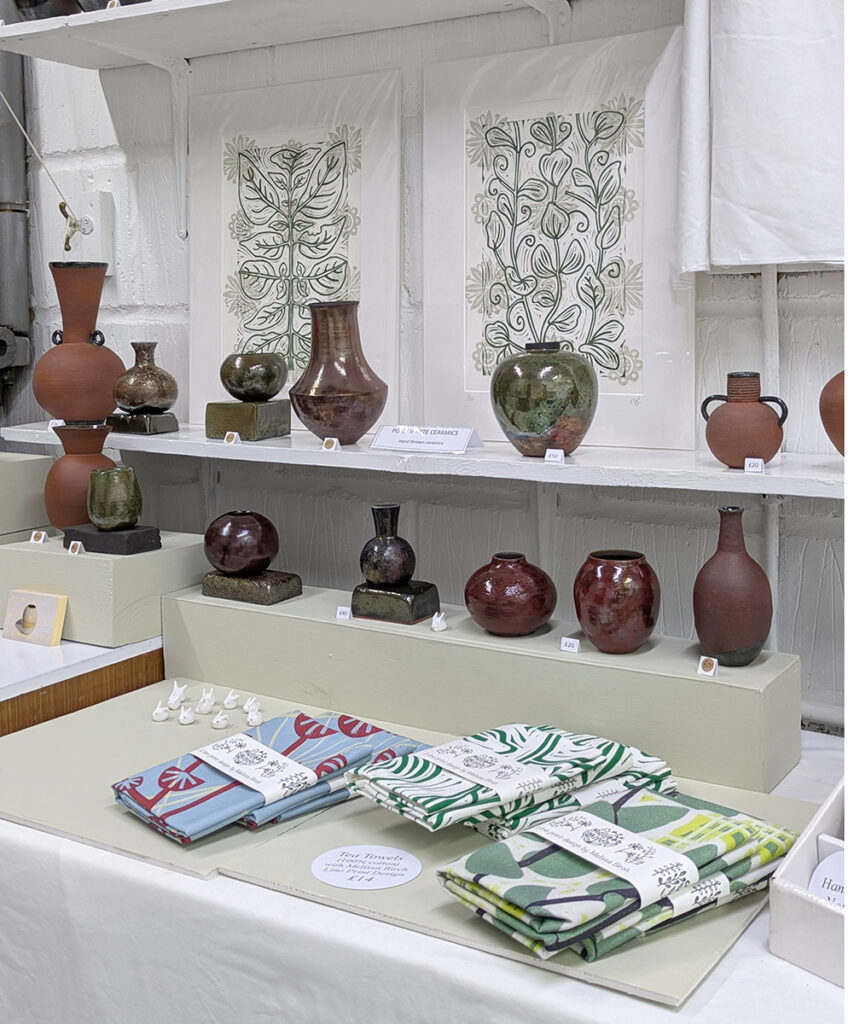
Display

There is plenty of potential to get creative with ways to display your work, adding height and depth using different pieces of furniture as props. Purpose built screens are also very useful. My husband put together two 6×4 foot screens which we use for the Art Trail and pack flat in the shed the rest of the year. To make these you will need: an 8×4 foot peg board sheet, several 2×4 pine lengths to frame the boards, and some 18ml plywood sheet to create supports stands for each side of the board.

Lighting

Good lighting is a must but not as expensive or difficult as you may think. Philips Hue light bulbs are reasonably priced and set to a cool blue daylight setting will light up any dark corners with a good balance of colour.  I use a clip on lamp and a cheap standard from Ikea fitted with Hue bulbs. Point them at the ceiling for a more diffused light.

Collaborating and Curating

Some artists love to exhibit simply on their own, but it is worth considering collaborating with others. There are many benefits including creating a show with more variety, attracting more visitors, and having an extra pair of hands to welcome visitors at busy times. Consider which other artists’ work would compliment your own. Artwork with a similar subject matter or media can lead to a themed approach, for example a house of printmakers or photographers. Opposites also attract, and a 3D artist will work with a 2D artist nicely, as well as making good use of the space because each will have different display needs. For the past two years I have exhibited with jeweller Alison Crowe and I really love the way the collaboration enhances and compliments our work simultaneously.

Refreshments

Visitors love the idea of a destination that promises cake. If providing the full tea and coffee service is beyond the man-power and space you have available, then some lemonade and a square of tray bake will still be gratefully received, and is really only polite to offer if visitors have walked some way in hot weather. Most venues will charge a few pounds for their refreshments.

Affordable Takeaways

Include some items such as cards or gifts which are in the lowest end of the price range. Much of the work artists do is expensive out of necessity due to the time and skill needed to make it, but your venue will be more welcoming if visitors know they will be able to afford at least a small item there, such as a postcard or bookmark.

I hope you feel encouraged to join an Art Trail and am happy to answer any further questions you might have. Feel free to email me via the Contacts Page!

Posted on

In My Garden

The subject matter and imagery of gardens are often present in my artwork and lino carving.  My relationship with gardening started when I was little, following my dad around the flower beds and learning the difference between the weeds which I could help to remove, and the flowers which he was cultivating and I was not to pull up!  My Dad had a scientist’s approach to gardening and tended to enjoy the outdoor environment through a lens of calm observation rather than judgement.  Even when engaged in the process of weeding the flower beds, he still had an equal level of respect for, and interest in the weeds themselves; showing me how they spread their seeds in so many different and inventive ways; some flicking them into the air when fully dried, others acting like salt shakers in the wind.  And we both found pleasure in discovering a particularly big specimen that we knew the pet guinea pigs would find delicious.

As I began to pursue my interest in art more seriously and became a young art student through the A level and Art Foundation courses, I can remember making sculptures based upon seed forms, being inspired by natural structures, pressing flowers, and sewing dried leaves to naturally dyed cloth…  I also remember a favourite birthday present being seed trays and packets of seeds with which to cultivate my own area of garden in a back corner.  I believe some of the dahlias are still there.

I sometimes feel I have learnt as many life lessons through gardening as I have through art.  For instance, when I acquired a garden of my own as an adult, I set about enthusiastically trying to create a traditional cottage garden to compliment our flint-walled cottage, only to find that these small walled gardens are a perfect host to slugs and not a single delphinium survived.  Open warfare on these slippery creatures was never going to work, but to my surprise other plants sprung up and seemed indestructible in the face of the mollusc army. I learned to interfere less and watch more, as wild buttercups, Japanese anemone and a vast trumpet vine flourished without any need for tending, watering or protection.  The right plants in the right place is certainly a motto that can be useful elsewhere in life.  The creation of something beautiful does not need to be, and maybe even should not be, a struggle.

I have recently begun reading more widely around the subject of gardening.  “Wilding” by Isabella Tree has given me an insight into the complex connections between plants, trees, wildlife and the microorganisms which live soil. I learned to do less and less invasive work in the garden as a result; to allow old branches to rot naturally and beetles, woodlice and fungi to do their important work undisturbed.  “The Garden Jungle” by Dave Goulson taught me the importance of flowering weeds, letting the grass grow long and selecting plants which support bees and other pollinators. I can now spot and avoid a modern hybrid which would have previously fooled me with its good looks, but is actually useless to the insect population.

Learning, observing and going a little more with the flow has given me a relationship with gardening that is peaceful and rewarding, plus a garden that hums with life, takes very little looking after and which delights me regularly with a new surprise – a self-seeded poppy, or a new family of blackbirds.  I don’t have go far to be gifted with new subject matter for a drawing or a print.  If I take the time to stop and look, I have everything I need right there in this garden.

Posted on

Making a Reduction Lino Print

There are many ways to add colour to a lino print, such as chine colle, jigsaw linoprint, or using multiple plates for example. I am drawn to the reduction printing process however, which I find particularly absorbing due to the methodical nature of the technique, and the problem-solving aspect to it.

One problem, that of registering the prints accurately, can be easily solved with Ternes Burton registration pins. The print needs accurate registration so that each layer lines up to create the desired image. I map out a plan on the desk of where the lino will sit, then tape two Ternes Burton registration pins to the desk. Before going anywhere near my printing inks I place each piece of paper face down in the correct position and affix the tabs to the paper so that I will be held in exactly the same position each time I print.

Using more than one colour means that I need to plan the colour scheme carefully before beginning. I often use Photoshop to try out colours on my early sketches or proofs so that I can see how the colours will eventually work together. After that it is a case of deciding which colours to print first. As a rule it will be the lightest colours and the areas of the lino which are going to be easiest to remove after printing the first layer.

The next stage of carving takes some careful thought so that exactly the right areas of lino are removed and nothing else. I will usually mark the lino clearly with a sharpie at this stage.

The second layer of printing is when the Ternes Burton pins become very useful, helping me to accurately position the first printed layer over the second.

As you can see, it’s a lengthy process. Once you are aware of this technique you become attuned to notice the different layers of colour in other artists’ prints and really appreciate the time and effort spent.

Hints and tips for learning the reduction printing method;

Plan carefully. You need to learn to think in reverse and this can take some time to get used to. We are more accustomed to creating colour effects by adding media to the page, such as in a painting. With reduction lino we remove the lino to reveal colour we have already printed… quite a brain-teaser when you think about it!

Start simple. You don’t need a really complicated image to get good effects with this technique, so begin simple, with just two colours until you perfect the technique.

Always print more copies of the first layer than you think you will need. It’s repetitive but you will be less worried when the odd print misaligns or goes wrong later on.

Invest in a pair of Ternes Burton registration pins and accompanying tabs – it makes life so much easier!