I’ve been teaching lino printing in small groups at Upper Beeding Village Hall for some years and although the content of what I teach remains relatively unchanged, the workshops are each unique depending on who shows up.
I tailor my teaching to meet the needs of the group, and to guide individuals as they decide what to print, which colours to use and how to go about it. It’s an exciting journey of discovery rather than a didactic lesson format.
Let me describe the group of five lino printrs who I worked with recently, and it will give you a flavour of what happens on Thursday evenings. The five who walked into the room on the first session had never met, were from all corners of Sussex and had varying previous experience. Before long we were chatting away about a wide variety of subjects as well as what we were learning with lino…
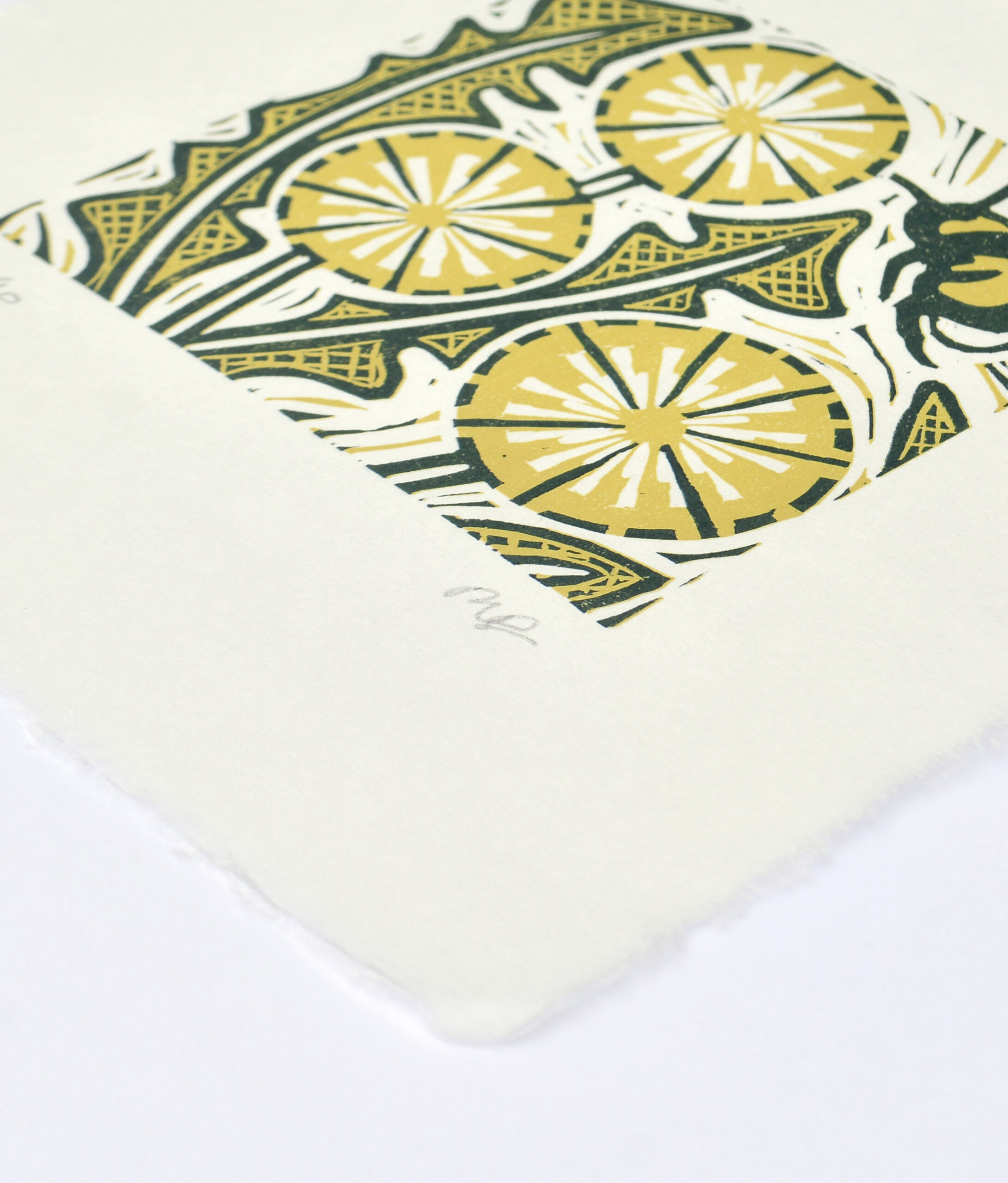
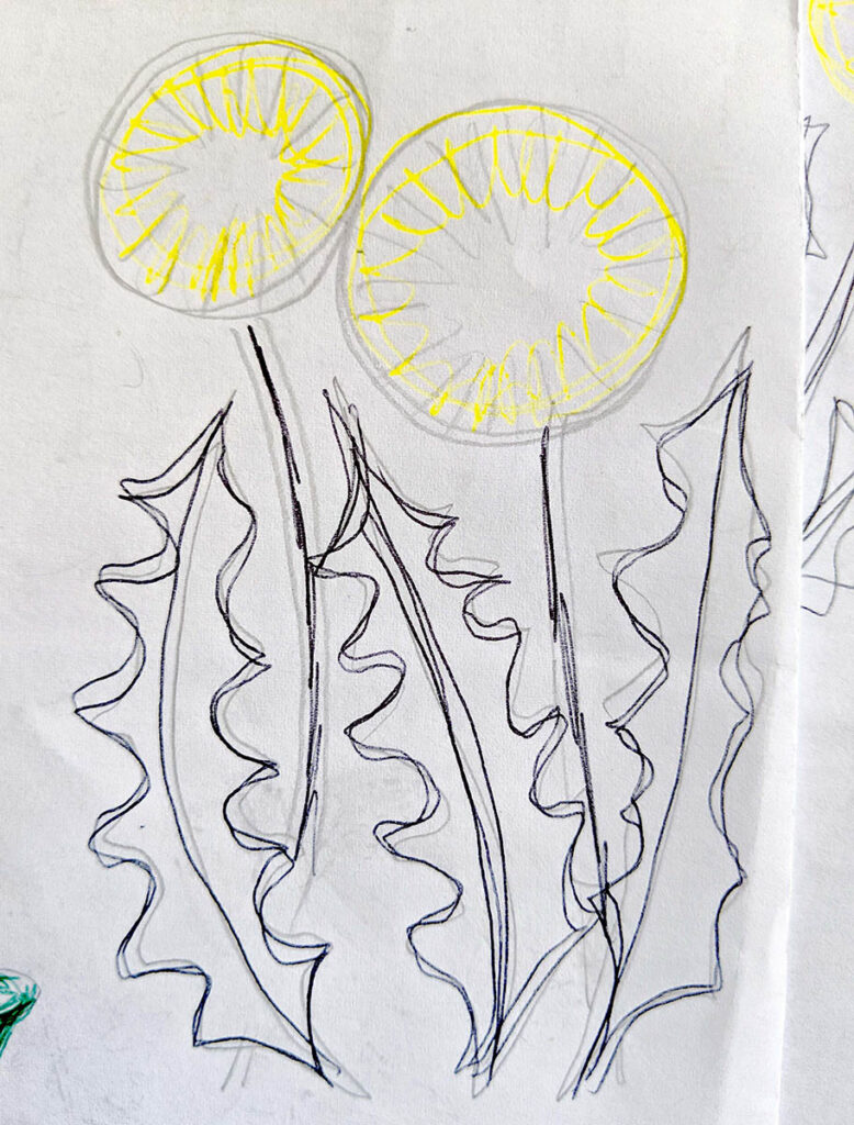
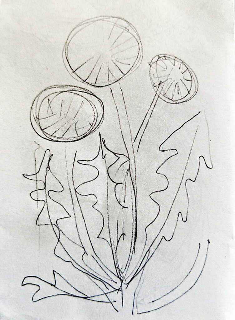
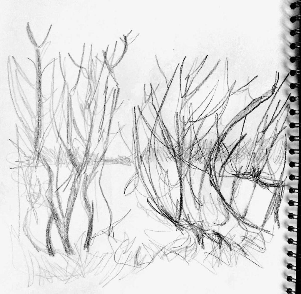
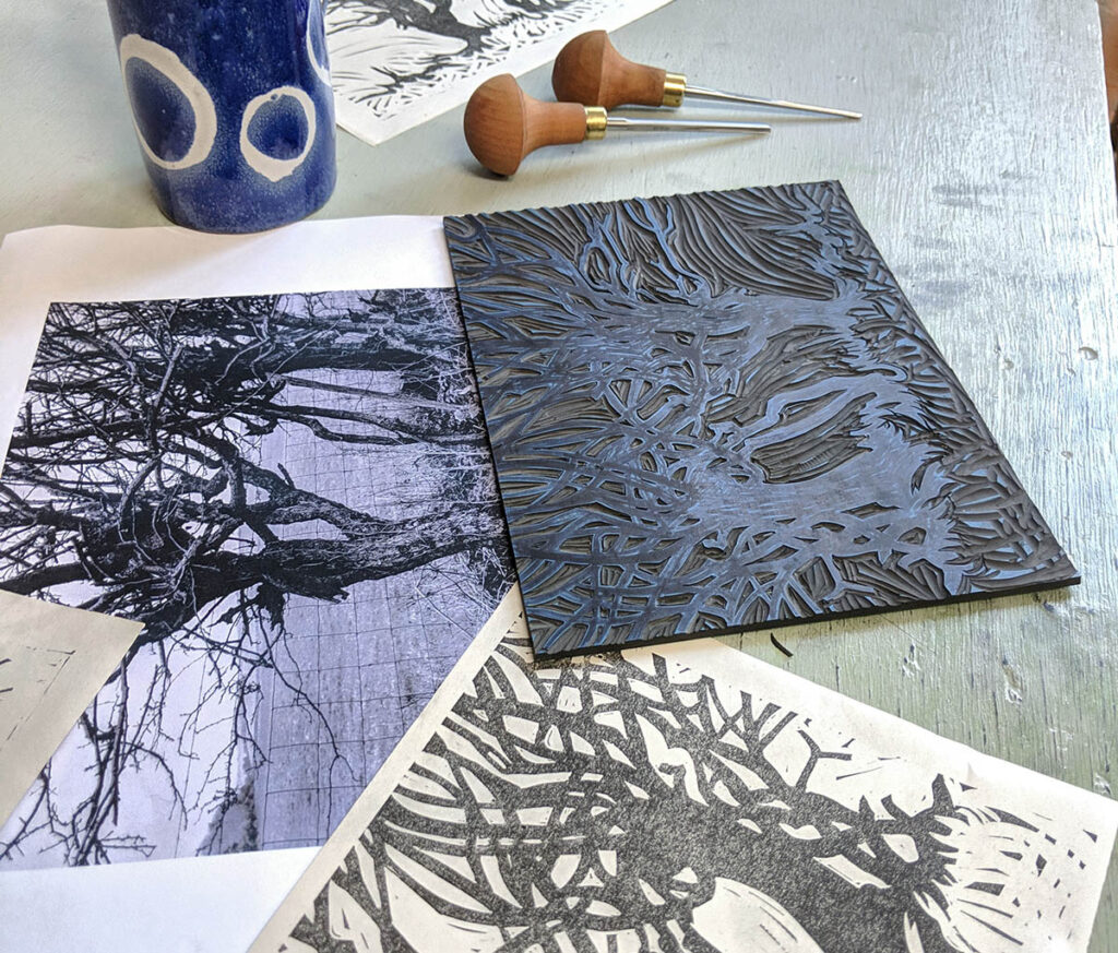
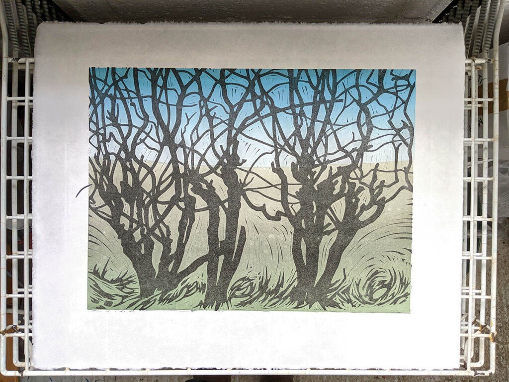
John and Paul had both had some previous experience of lino printing and brought their own tools with them. They each wanted to learn about reduction printing and this is what they focused on for the five weeks, learning how to reduce an image to separate colours, register (line up) the block with the paper and print layer by layer until the image is complete.
It’s difficult to explain the method with words, and we all agreed that it’s only through the process of doing it that it starts to make sense.
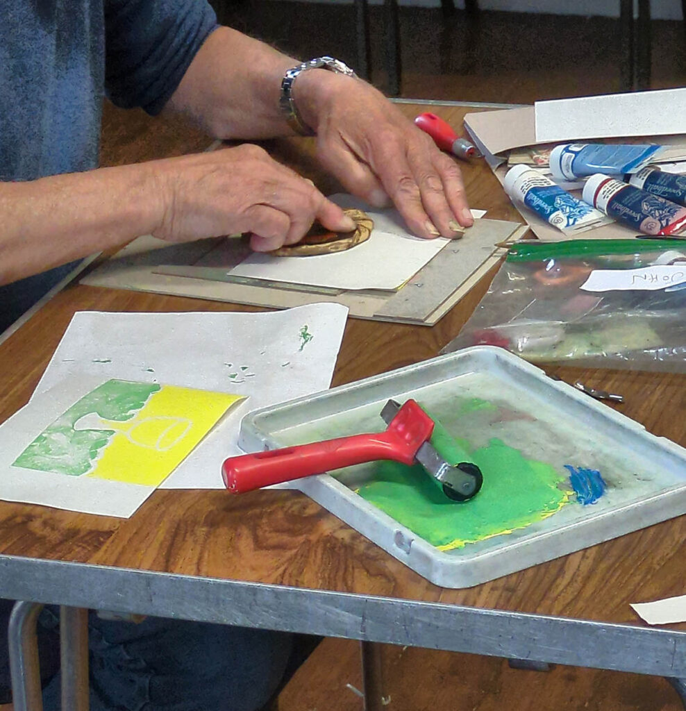
Alison and Wendy were new to lino printing and keen to get started. We covered a lot in the first two sssions and then I was able to teach them two more techiques; chine collee and jigsaw lino.
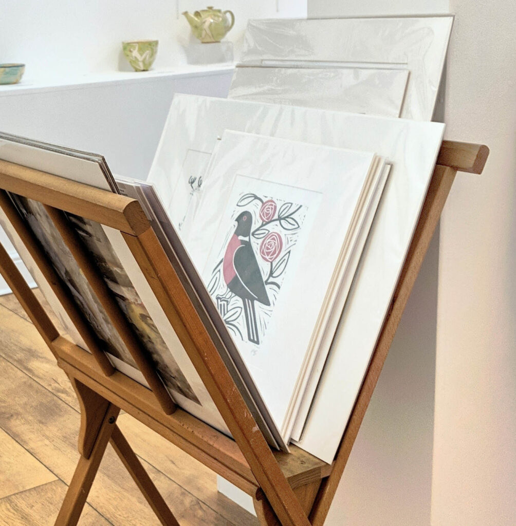
These processes are fun ways to add more then one colour to a print without going through the process of reduction printing. Lots of lovely colourful experimentation ensued!
Clare had already learnt these techniques on a previous course with me, and I was delighted that she wanted to come back for more. Many of the principles I was explaining to the others she had heard before, but she was able to use the time to develop her own work and style.
We talked through what techniques might work best for the effects she wanted. I was able to offer some useful tips as she explored and experimented.


One of the best things about learning in a group like this is the rich opportunity to exchange ideas and learn from each other.
With so many different activities going on in the room each course really is unique. I certainly have never been bored despite teaching lino printing for years!
I particularly love it when people start asking about what kit they would need to buy in order to continue printing at home. As they start jotting down a shopping list I know they are going to be enjoying lino printing for hopefully many years to come.