Posted on

For the Love of Hosho Select

I discovered the paper Hosho Select in the Hove art shop well known to us locals as “Lawrences”.  They have a display of the Awagami papers there, and you can see the surface quality, transparency and colour of each paper before buying.  

For the uninitiated, Awagami Papers are made in Tokushima, Japan and are produced by hand using natural and renewable plant resources. It’s an impressive fact that the Fujimori family who run the Awagami Factory have been making paper for 6 generations. You can read more about them here; https://awagami.com

I was drawn to the particular paper named “Hosho Select” and have been using it ever since.  The back of the paper is slightly textured and reveals its fibrous nature, but run your fingertips over the printing surface of the paper you feel the most amazing sensation as if brushing against silk.  It is this extreme smoothness that makes it such a good printing paper – not a fraction of its surface is going to miss the plate.

I have experimented with other papers from the Agwami range and I must admit all of them are beautiful in their own unique ways.  Hosho Select remains my favourite. It has a particular thickness with makes it just right for printing with a barren as I do.  Thicker papers require more elbow-grease than I am capable of to get a good print!  The gentle off-white tone is perfect for me too, as the colour palette I create with my inks is very specific and a coloured paper could throw the design completely.

Finally, the fact that each sheet has been made by hand on the other side of the world is an inspiring thought.  I feel connected to makers and creators even though far away, and this connection is empowering in itself.

Posted on

How Does a Dandelion Grow?

The design process for each artist is unique and often very personal.  Some artists have a very conscious and clear process of working, or possibly even responding to a “brief”.  For others the process is less obvious.  Much of the creative work may be being processed as subconscious activity, and actions and decisions can feel intuitive rather than logical.  My own practice appears haphazard and messy at times, but when I look back at the journey, there is often a visible pathway that was steadily being pursued.

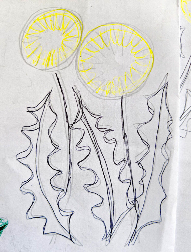
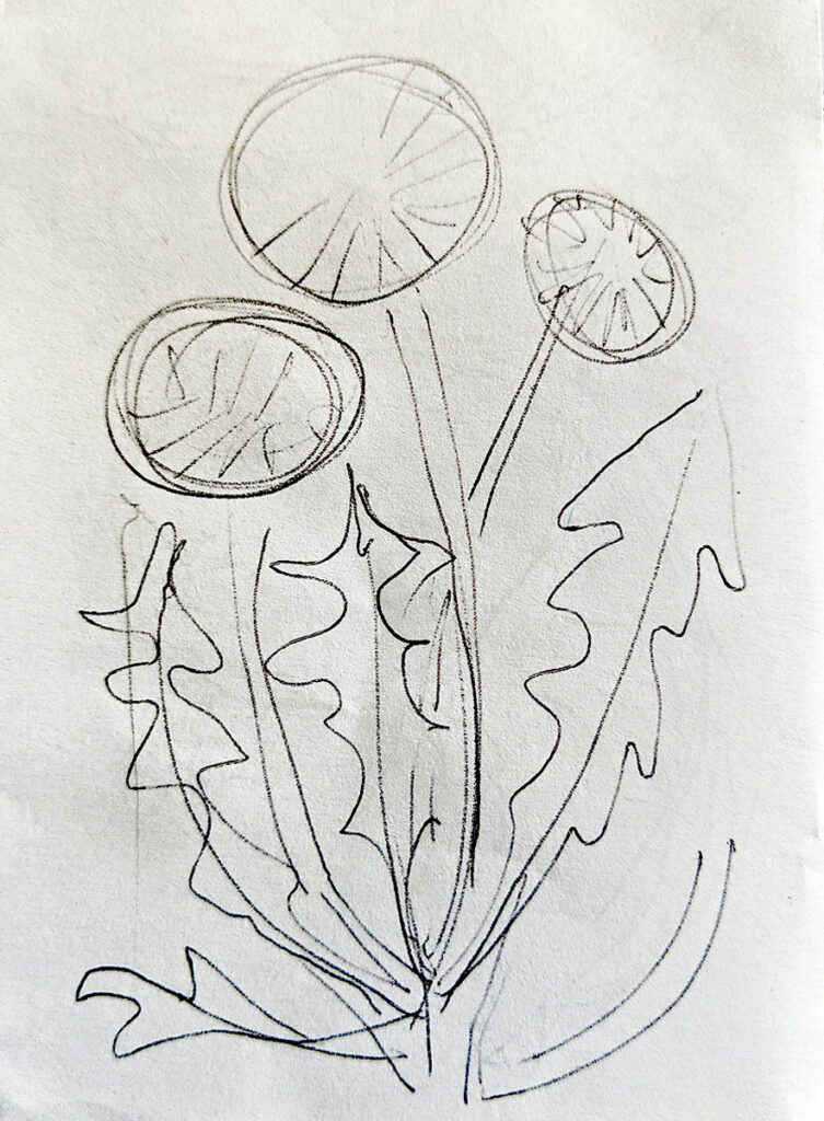
I thought it would be fun to put together a story-board to show each stage of my thinking.  I used my current project of the dandelion print, and collected together a photo of every stage, from the first very scruffy and quick notations made on a car journey, through all of the hesitations and changes made along the way.  In each sketch the composition changes slightly, the shapes of the flowers change slightly, as I wrestle with creating an image which is still faithful to the excitement of my original idea and yet somehow more “finished” or full.

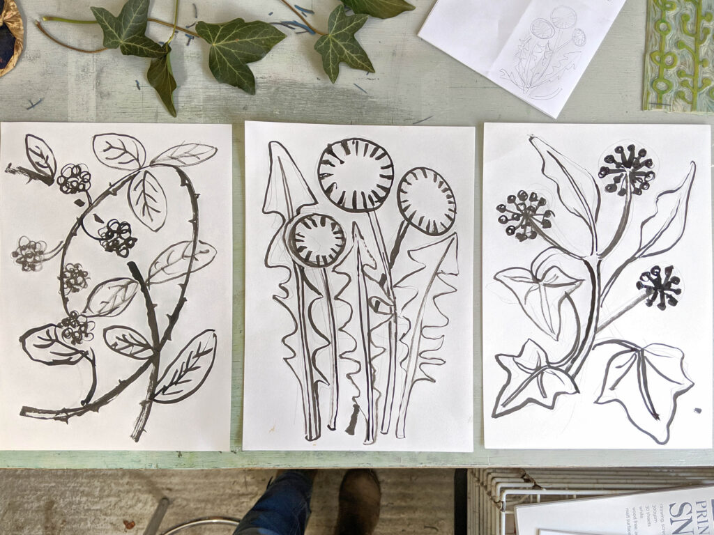
The first two sketches were literally scribbled on some scrap paper that I found in my bag as we travelled along the motorway. For a few days after I kept trying to re-sketch the composition, struggling with the shape of the flowers and the layout. I spent time looking closely at the dandelions in our own garden and drew the leaves from observation to gather a better understanding of their shape. The fifth drawing was made on a large scale using ink and a brush to try to bring some energy and confidence into the composition. After that I consolidated it into a design, ready to trace and transfer to the lino.

It has been interesting for me to look back at the journey this image has been on. Too often my sketches are scattered across different sketchbooks or on scraps of loose paper and I cannot remember where they started. When I was teaching art in schools I often wished I could share more of my own process with the students to help them understand the relevance of what was described by the exam boards as “Development”.  It sometimes feels like an artificial process made just to help an examiner assess the work. However I really believe it is the most vital part of the work an artist will do. 

My key takeaways would be this;  Rarely is it a good thing to simply stick with your first idea.  Any idea that’s worth something is always worth developing, testing, experimenting, and trying to improve.  There can be disheartening moments when it feels like it’s just getting worse the more you work on it. If this happens take a break and try again the next day.  Something will always come of it, even if not what you expected or planned.  This is possibly the most rewarding aspect: allow the work to take the lead, just observe what has happened and allow the next stage to follow as a natural result, loosening any pre-conceptions about what you wanted the work to be. 

As artists, we design, and imagine, and can guess where things might be going, but are never really in control of the end result.  The best we can do is to observe, take note, and learn as we go.

Posted on

Researching a New Project

Sometimes the best laid plans do not lead to quite the results you were expecting…

After spending the winter focussing on the naked branches of the “Winter Hedgerow” series I had been looking forward to getting my teeth into something colourful and celebratory again.  I planned and booked a series of visits to some of the most beautiful gardens of Sussex, anticipating their re-openning and eager to indulge myself in some horticultural delights.  The sun burst forth in April and I thoroughly enjoyed walking, sketching photographing the early blooming plant life.  My camera soon filled with images of blossoming cherry, and my sketchbook with narcissi and primroses.  But what was the subject that, after all this, began to truly obsess me this month?  Well… dandelions.

Maybe it was my recent education in how important these plants are to support the early pollinators who venture out at the beginning of Spring when there is little other pollen available.  Or perhaps it is due to the intensity of the colour which after a long grey lockdown seemed like food for the eyes.  I suddenly felt that these under-dogs needed to be celebrated next, to be elevated to the status of “art”, and given a second chance at being loved and admired by the general population (for whom they are mostly deemed to be “weeds”).

Plants which could prove good companions in the series arose quickly to mind; flowering ivy, who’s structure and silhouette I love, and is also a vital habitat for wildlife with its thick foliage, and blackberry brambles, which horrify many a gardener, but provide nutrient-rich food for birds (as well as many of the local children) each autumn.

A new series of sketches and photography and research developed quite in reverse to the elegantly maintained gardens I had been visiting.  What a surprise! 

But then again, maybe not… Is it simply a matter of looking at the same subject from another angle?  As my Dad once told me; “A weed is no different to a plant… It is just a plant in the wrong place”.

Posted on

The Galleries Re-open!

I’m sure that I am not the only artist who is delighted to see the galleries open again.  Last Sunday was the first time I had been back behind the sales desk at Chalk Gallery in Lewes since December!  What better way to spend the day than being in a beautiful space, surrounded by beautiful works of art. 

I am currently exhibiting the “Winter Hedgerow” series there.  Chalk Gallery has a designated hanging team who exhibit our work for us, and it is always a treat to see how they group and display the artists’ work.  My prints are being kept good company by fellow printmaker Sue Collins on one side and painter Andrew Milne on the other.  All three of us draw inspiration from the local countryside of the South Downs and in the current exhibition there are echoes of similar wintery colours and sinewy tree shapes found in our work.  It forms a very cohesive and reflective exhibition.

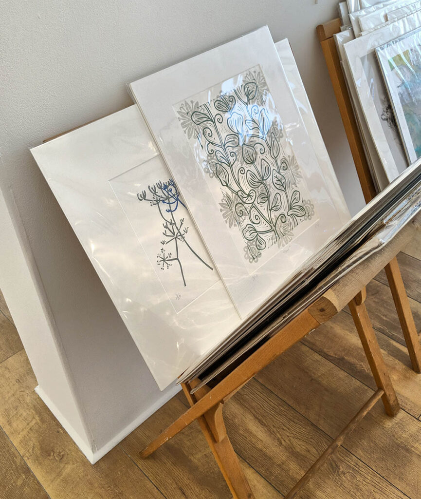
We also has a good selection of works in the browser for customers who prefer to select their own frames.  It is good to see my prints once more at home here.  Although unframed, they are still presented in a window mount made from archival, acid-free card.  The mounts are made-to-measure for each piece. Once upon a time I cut my own mounts, but have since learnt not to compete with the precision of a machine cutter!  I particularly like a soft white mount card called “minuet” and use this for the majority of my work, with archival backing card behind.  Once mounted the prints are sealed in cellophane bags or wrapping to keep them in pristine condition until they are sold.

So the artwork is ready, the gallery is looking great, and I do hope that if you are local and reading this, you can come and visit us soon!

Posted on

The Making of “Winter Hedgerow”

Now that “Winter Hedgerow” is completed and hanging in Chalk Gallery, I would like to share a little more of my working process which I have documented in photographs over the last year or so.

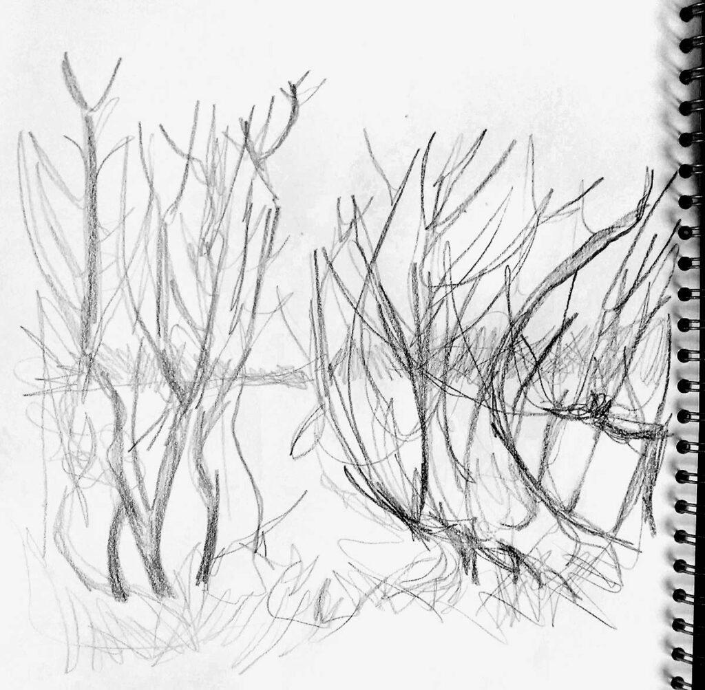
The wind-blasted hedgerows that line stretches of the A27 first caught my attention two years ago.  I had been driving to my studio in Worthing listening to the radio and finding a state of gentle awareness that so often arrives once the children are packed off to school, and I have the space and time to draw and print.  I admit that I dislike cars, and traffic, despite driving one and being part of the traffic…  The naked trees struck me as so vulnerable amidst the pollution, noise and speed.  They also seemed to say ‘winter” in a way that was so irrevocable. These sketches were my first emotional response.

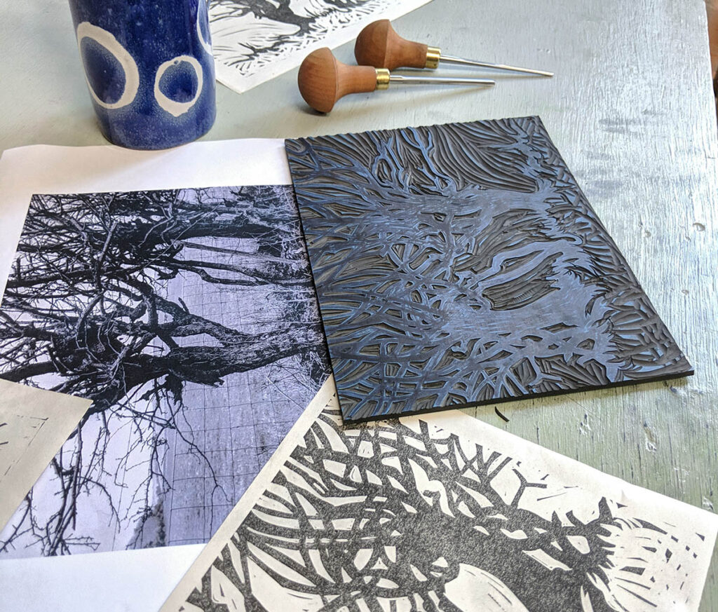
I knew the subject matter did not lend itself to lino print in that there are a predominance of tangles and textures, rather than clearly defined shapes. However I am a lino printer, and I could not resist tackling it in my favourite medium all the same.  I decided to approach the lines as expressive rivers of energy rather than attempting to depict every single twig.  I felt I could still capture the cave-like dense nature of the hedgerow, and its nakedness, with the bold lines which result from my style of carving. I draw in pencil and felt-tip pen with little concern for neatness.  It feels as if I am carving an idea out of the page as I work, and I will layer up, change colour, and scribble over until the design is clear and confident to me.

Then begins the process of tracing, transferring, sometimes re-drawing and finally carving.  The lines take on a personality of their own during this process which is one of the aspects of lino printing that strongly appeals to me.  The medium and process start to dictate and tell the hedgerow how to look.  It is never an option to create a ‘accurate” copy of reality so the artist is presented with a problem to solve instead – how shall I do this? 

I use only three pfiel lino cutting tools; a large and small gouge, and one v shaped.  Again, I like restriction.  It forces me to problem-solve, and I find this is where creativity is at it’s richest.

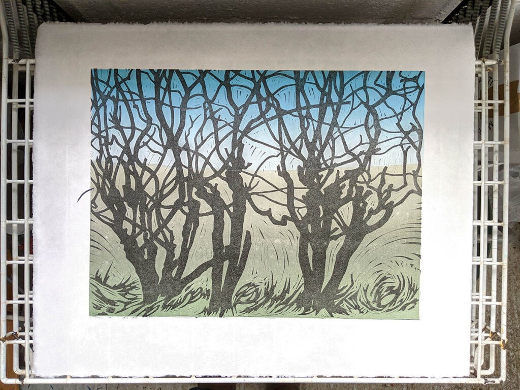
The background needed to be a ‘rainbow roll’ in order to capture the atmospheric effects of a landscape; sky gently fading to white, and the green of the fields de-saturating to grey as they move towards the horizon.  Creating the right palette of tones blending evenly across the roller is almost as time-consuming as the carving process!

The first print was created and I initially called it “Winter on the A27” because that particular spot was still so important to me.

I had trudged up and down the hard shoulder photographing the hedgerow from different angles and had quite a collection of images stored on my computer, so I decided to develop the project.  I also felt it needed to exist in a large format to have the impact I had felt when photographing it.  Two more prints were designed; a companion piece of the same size, and a larger 30x40cm piece.

I continued to carve and print through the winter months of early 2021 finally bringing the series to a completion in March.

The last step will be to sign, edition and frames these prints ready for their new home in the Chalk Gallery, Lewes, which opens again on 15th April. 

It’s been a long project.  But it’s been worth it.

Posted on

Framing artwork

This week has found me busy framing work for the re-openning of the galleries in which I exhibit. After experimenting with various suppliers I have settled on bramptonframing.com as by far the best. I love the fact that due to their website, I have absolute control over the dimensions of the frame, the mount and the various colours and textures. When the frames arrive they are always well packaged (handy because I can re-use the packaging) and beautifully made.

As you can see from the video I take the final steps of positioning and framing the artwork myself.

It’s important to use good quality archival materials when framing an artwork so that no damage is done to the print over time. The tape used to secure the print in place is acid-free, as is the backing board. Then the back of the frame is sealed all around the edge with framers tape to prevent dust, insects or mould spores finding their way in.

Should look good for a while!

Posted on

Two Birds Looking

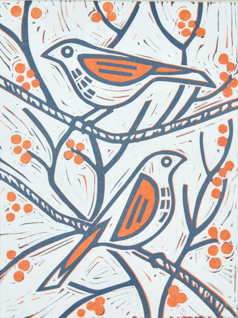
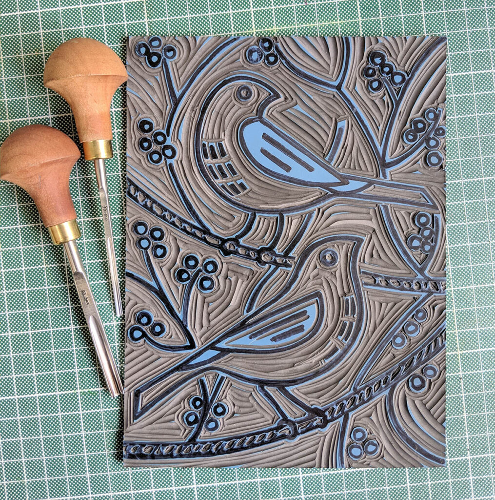
My edition of “Two Birds” is down to just a few prints now, and I love the design so feel rather sad not to be able to stock it in my shop for much longer. One option would be to create giclee prints of the original print (which I always keep) but while my business is still small, I am choosing to remain faithful to the handmade process and sell only genuine hand-pulled prints to avoid confusing my customers. A lot of explanation on the difference between a lino print and a giclee print of a lino can become involved otherwise!

The answer for me has been to create a ‘companion piece’ which is something I often do. This will be called “Two Birds Looking” and features the same pair, having shifted position slightly, one looking back over its shoulder as if it may have missed something. The other raising it’s head in awareness.

This second piece is a reflection on lockdown life just as the first was. The two birds always represented souls in lockdown to me; fitting together, blending into their habitat, which at once supports but also encages them. Life on pause maybe.

The second lockdown took us by surprise by having it’s own unique nuances. We thought we knew what to expect, but it was a different experience in so many ways, and once again we had to adapt and evolved to survive. “Two Birds Looking” is my homily to that time.

Posted on

Working on the Winter Series

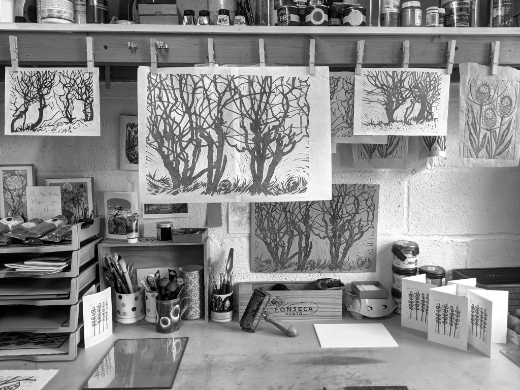
View of the printing studio of Melissa Birch

My major project this winter has been to develop a series of prints based around images of windswept hedgerows which I recorded last winter. A year has gone by since taking the initial photo shoot but it feels like a good project to return to during the winter months when I am once again struck by the bleakness of the landscape.

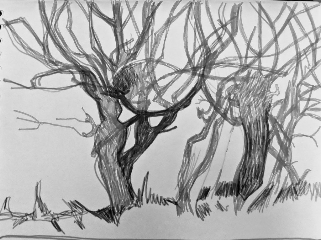
Drawing of winter hedgerow in black and white

The naked hedgerows speak to me powerfully of loss, but also the potential for new growth even though we can hardly imagine it possible.

So listening to Radio Four and carving the sinuous network of lines was a good place to be while the lockdown continued in the world outside.

Posted on

Teasel Notebooks

Notebook with hand printed design of teasel seed heads

Delighted to add a new item to my Etsy shop this month which was inspired by a customer who asked after my Teasel design as a notebook. The original design is a two colour reduction lino print so I had to re-carve the block to make it work in monochrome but I’m pleased with the result. I use Caligo printing ink on the which is oil based and dries to a robust, water resistant surface.