The term abstraction can mean different things. It is used for different purposes by different artists. Consider the many different directions it took when it when it exploded on to the art scene over 100 years ago for example. There were those seeking to disrupt the picture plane such as Picasso, or needing greater freedom of expression such Kandinsky (but also Picasso). In it’s most extreme form, and possibly where it earns a bad reputation among gallery goers, is when it becomes a search for absolute purity, such as Malevich’s quest with “Black Square”. I love all of this complex history of abstraction, and for me it is still a constant and vital element of artistic practice.
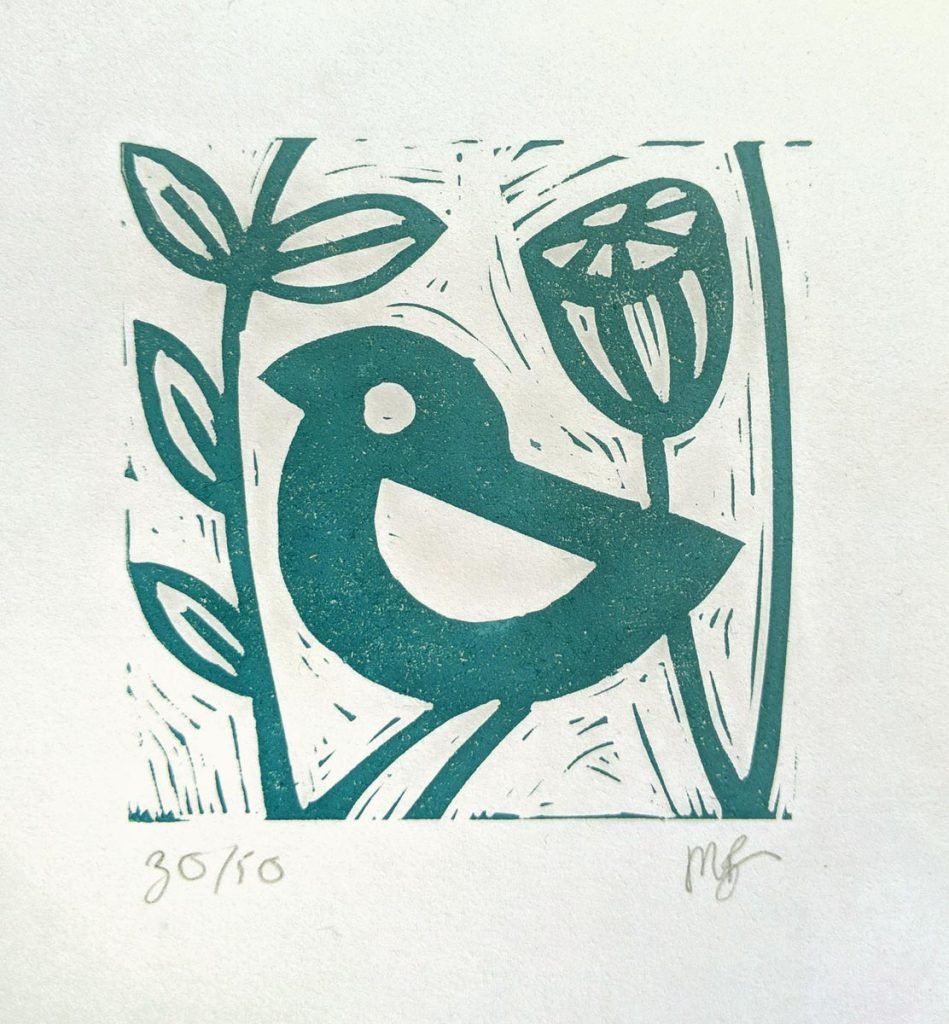
Contradictorily however, I am also drawn to observational recording and feel compelled to describe the very real things around me. Designing lino prints allows me to play with the tension between this reference to the real, physical world and an abstract use of line and shape. The relationship can be pushed one way or another; I can dial up the flattening and geometry of shape, or draw out the observational accuracy. It is not just a sliding scale between one and the other, more likely the two forces are in conversation with each other, often complimenting or strengthening each other in surprising ways. How is it that a semi-circle can say “bird’s wing” more powerfully than a detailed study? A blink of the eye, or change of context, and the same semi circle becomes something else entirely. It is like a teasing dance between reality and representations of reality.
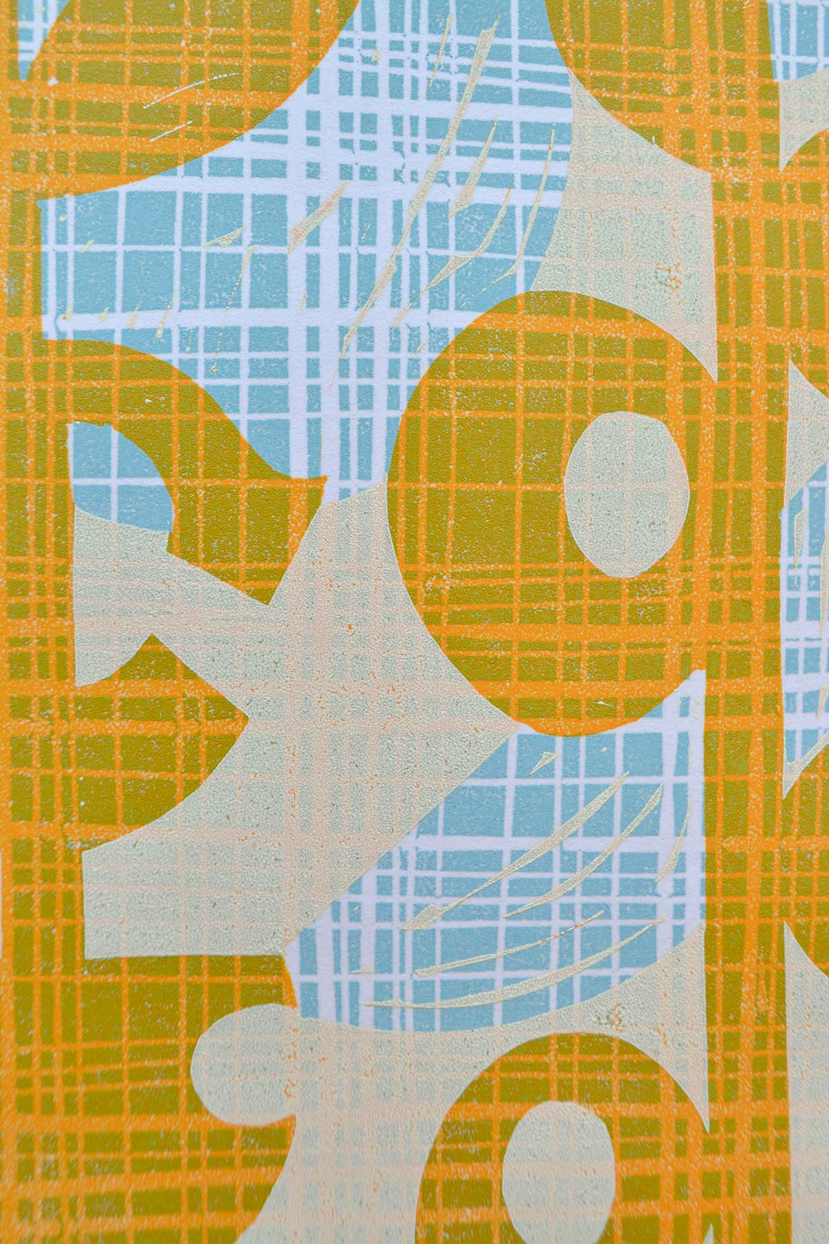
Then there is the method I choose to employ; printmaking. Lino print lends itself to abstraction in the very process by which a print is made. There is the splitting apart of colours for each layer of print. The artist has to analyse and select the limited number of hues that will best represent the subject, knowing it can never imitate it absolutely in the way of an oil painting. The layers of ink built upon a papery surface remind us that lino prints are very much a hand-crafted item. The physicality of the process is visible in the finished product and I like to accentuate this by leaving “noise” in the print. Even in the most delicately carved and subtly toned works can never emulate what can be achieved with a brush and slick of oil. Not when compared to the unearthly realism of a Rembrandt for example. I love the fact that the carving tool is a relatively crude implement, given to producing hard lines and flat shapes. I love to work with this challenge and to see what will emerge. To explore references rather than illusions.
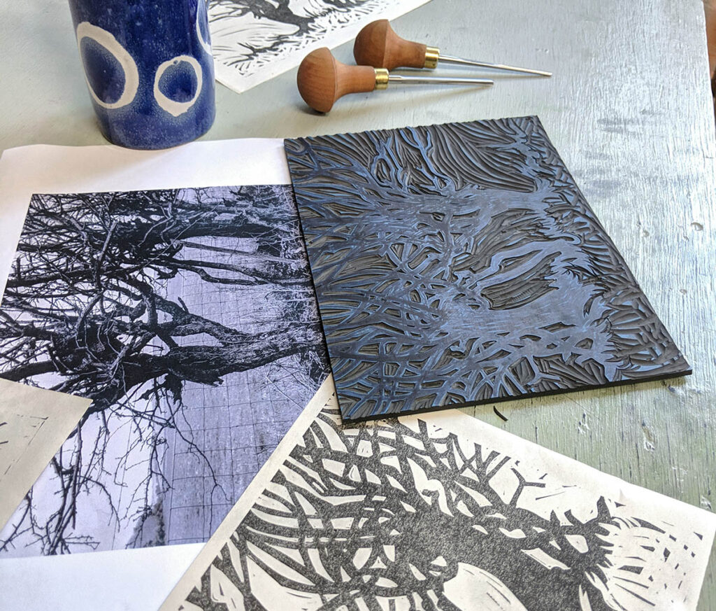
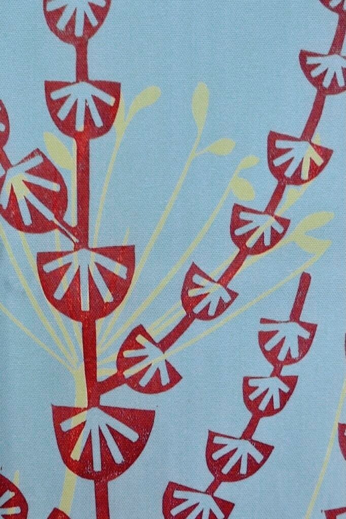
In “Dock Flowers & Grasses” the use of a simplified motif to represent the densely textured flower heads was my main preoccupation. It took time to develop a carved form which suggested the lightness and intricate structure of each flower head without becoming over-worked and heavy. Once found, the shape is loosely repeated in varying sizes and proportions, the same way that nature repeats a pattern. If it works, do it again. The pattern is reinforcing yet flexible; no two flowers are exactly the same but they are built from the same code.
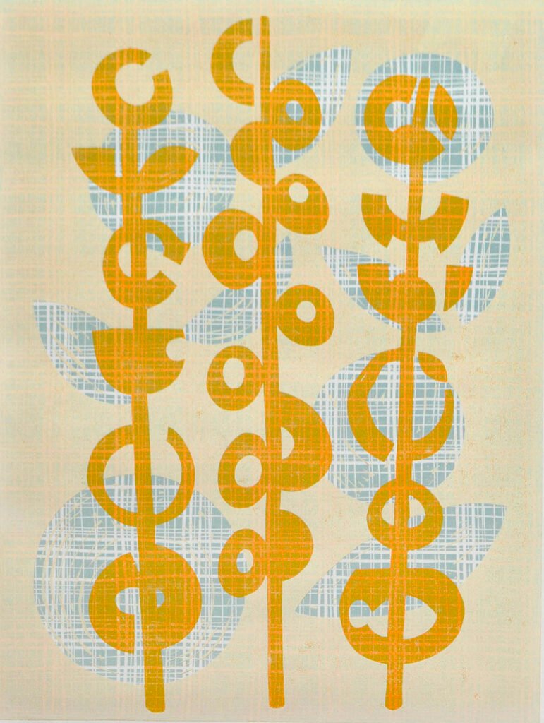
“Orange stems” takes abstraction one step further. There were no flowers in front of me when this was created. Instead I drew from a memory bank of flowers and seed heads that I have collected, recorded and studied for years in my minds eye. It feels as if they have imprinted themselves there. To create more freely abstract shapes in this way offers something iconic. Something which says “Flower” and means all flowers. I hope it might transport the viewer to their own memories of stems and seed heads. Rustling through childhood memories and long-past summers to open up their own interior world.